Pre Production:
 |
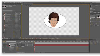
| Too much side space? |
 |
| Not so weird when bubble's are in! |
- gather animations for bubbles (or clip-art for the rough tests)
- organize each shot into a composition
- listen to pump up music!
Progress:
The main workflow I used for the compositing of the project was as follows:
Motion Tracking:
First I'd add a null object to the comp. and then find something on the actor to track to - usually I did something on the face (so the motion of the bubble bouncing around would match when the actor turned their head). I chose not to have the bubble 100% attached to the actor - as in when the character turns their head, the orientation of the bubble does not necessarily move. Both the director and I felt it was more important to have the bubble readable than to follow every nuance the head made - as we found out in some earlier tests I did.
Bubble Composition:
Next I'd make the bubble itself. I used the same template for most of the bubble outlines and just squeezed and stretched as needed. Within each shot I had a new composition for every bubble that was made - and I did this for 2 reasons.
 1. When you turn the layer into 3d everything inside the bubble is on the same plane since it's just a nexted composition. That way I wouldn't have to worry about one part of the bubble (the outline, the shadow or the animations itself) popping out in Z-depth just because I didn't line it up properly.
2. If each bubble was its own composition, it would be much easier to later go and swap out or replace animations. I knew I'd be doing a rough cut version (2 at least) as well as the final, and I wanted to make sure I had things organized so say, 4 weeks in the future, I could just as easily navigate through and replace the animations with newer ones, or tweak the way something looked.
Once the bubble was made I'd drag it into the shot composition, turn it into a 3D layer, adjust the orientation based on the character's head position, re-adjust scale and position so they never went over the actors face, and link it to the null.
Next step would be to add the lights to help it integrate into the world better. I generally used point lights, which allowed a small "vignette" with the shadows coming across it. During this stage I'd also adjust for reflections. I had considered doing shadows for the bubbles, but in the end it wouldve required too much masking and it wouldn't be that noticable anyways.
 |
| Can you spot the differences? |
 |
| It's all about the details! Check the wall. |
 |
| Lots of masks for 1 simple move. |
The final steps for me are Color Correction and rendering. For some reason that I don't know (maybe Ben can give me some insight?) when AE renders a file out, the colors become a lot darker. Even with the same codec (ProRes422) and all the settings, the image comes out a bit darker. So I just make 1 adjustment layer with the color correction I need and apply it to all the shots within a scene - regardless of having VFX or not. Otherwise it would take a super long time to match the shots with no VFX to the slightly darker shots that do. After that it's off to the render queue and me off to bed! ...HA.
Anyways, that's the process I went through for VFX on "Kinks". Come to CMB on Dec. 12 at 12PM to see it screened!
As for what I'm turning in, 1) the sound people need to go through the final mix and all, 2) Not sure I can screen the director's movie in another class! But here's more or less what it'll look like.
Kinks Excerpt from kabraz on Vimeo.


